Often, after an artist finishes working on a character, location, or icon, they get the feeling something is missing. Vitaliya Bredikhina, the art lead at Allcorrect, has put together a list of six simple ways to give your game art a little extra punch.
Silhouette
No matter what your drawing depicts, the silhouette always plays an important role. Plan your design in such a way that the details form a part of the silhouette.
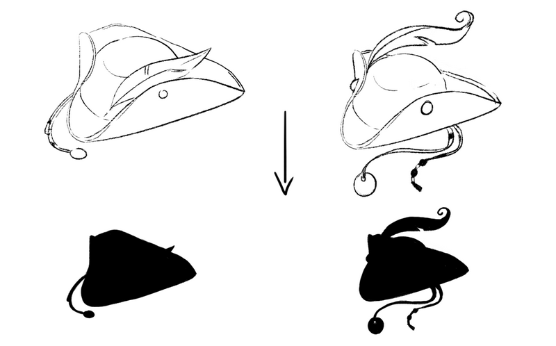
How do you check? Fill your image in with one color and see if you can guess what it’s supposed to be.
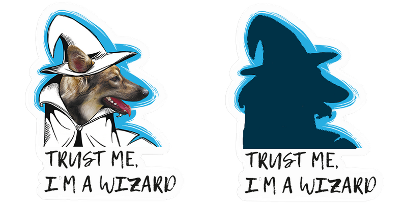
In fact, this tip is useful both for design and for practical purposes. In games, characters or items that haven’t been unlocked yet are often depicted as a contour. Performing this test helps you figure out if the player is able to identify the object.
Color
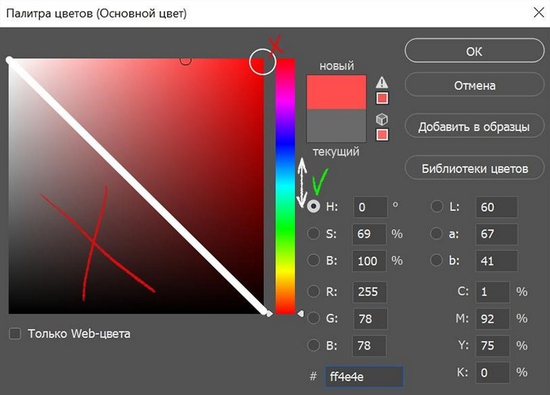
A common mistake that beginning artists make is muddying their shadows.
If you’re struggling to eliminate this bad habit, use this lifehack: split the standard Photoshop palette in half diagonally and don’t use any colors that are in the lower half. To create the light and shadow for the game, move between the colors on the palette. You also shouldn’t overuse the peak value of a color (the upper right corner).
Sticking to this simple scheme helps your images stay vivid and clean in most cases.
Tonal Relations
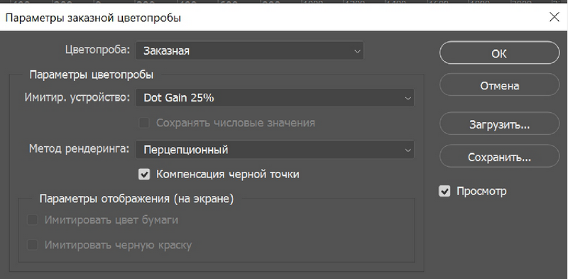
We often forget that both color and tone play an important role in the legibility of the details of an image. The general formula for selecting shades is simple: light on dark / dark on light + a middle tone to make sure the contrast between the shades isn’t too stark. The best way to check this isn’t just by converting the image into black-and-white (Photoshop artificially adjusts the tones). Instead, you should use a customized color proof.
Lighting
Even when you are drawing a subject that does not interact with the surrounding environment (like an icon), you need to determine where the light source is coming from and maintain that direction for the entire image. The location of the light source affects the direction and intensity of all the shadows in your piece, as well as the location of accent highlights and reflections. The proper location of the light source (as well as the temperature of the light) also helps give your image the right atmosphere.
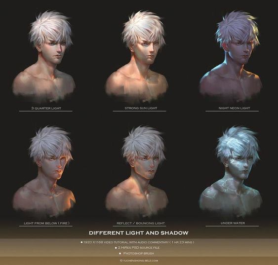
Source: https://yuchenghong.gumroad.com
Material Textures
Artists are often very eager to show their work off to the world and don’t spend enough time developing the materials in the render. This can make the image look unfinished.
Pay special attention to textures. Using references can help you draw them properly. Study and analyze images drawn in different styles. Copy them and think of ways to improve the material. Ask your friends if the stone you drew really looks like a stone, or if the shard of glass really looks like a shard of glass.
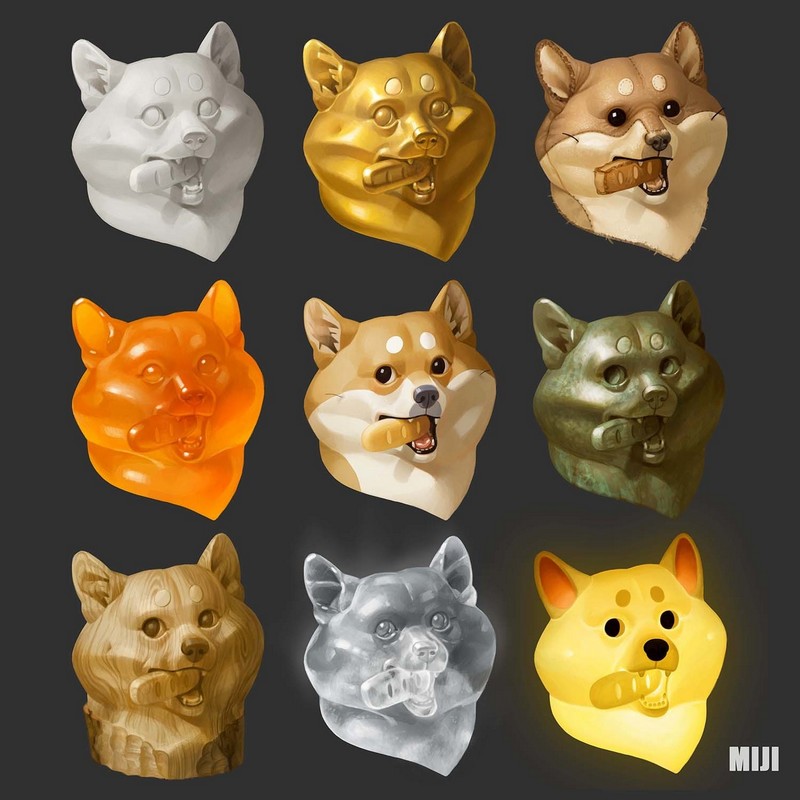
Source: https://www.artstation.com/mijilee
Aerial Perspective and Focal Point
Perspective and focus are important for more than just work on the background. They are equally important when drawing characters and items.
Even a small object in a space doesn’t look the same at different distances from the viewer. The changes may be small, but if you make some minor adjustments to tone/color moving away from the focal point in the image, it adds some vitality and authenticity to the image.
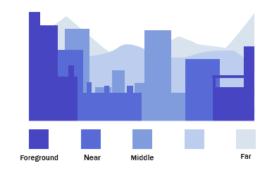
These tips, which may seem obvious at first, will help you make your graphics more expressive and vivid.
If you already knew all these lifehacks before reading the article, then we’d love for you to join our team of artists and work with us to create cool games. Send your CV to hr@allcorrectgames.com.


